Graphic design and branding for one of Norway’s biggest nerdy conventions
What is Desucon? Desucon was a pioneering sci-fi, fantasy, and Japanese culture convention for young people in Norway. It was organized by volunteers and held four times per year. It was known for its size and popularity
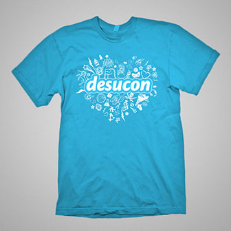
The challenge The convention required a cohesive logo and graphic design. The logo needed to be easily recognizable and simple to use, as the individuals responsible for implementing it were volunteers who were not designers. There was a limited budget for photographs, and it was difficult to use images taken at the convention due to the majority of attendees being minors.
Make it blobby I designed a text-based main logo using a soft font with a thick outline and an additional, thin white outline for added contrast. The font and outline were chosen for their friendly, comic book-inspired aesthetic, as well as their versatility – the logo would be legible on any background and at any size. The theme logos also included a subheading with the same outline, and a corresponding pictogram. To add visual interest and color, I used a set of copyright-free clip art to create collages that complemented the overall design. The mascot, Roar the Rawrzilla, was also incorporated into the clip art and featured on merchandise.